Tony Tuckson

The Abstract Sublime
Art Gallery of NSW
To February 17

Tony Tuckson at the AGNSW (photo Jan Courtin).

Tony Tuckson at the AGNSW (photo Jan Courtin).


Makeshift, Abstraction and the Australian Patina, Terri Brooks, excerpt PhD exegesis 2009.

'In Tuckson’s sketch book drawings[77] he reinvents the tradition of drawing with new perspectives and flattened fields. There is a merging of positive and negative space rendered in a spare lineal manner of simplification and reductionism. This influence undoubtedly stems from Tuckson’s visual observations of Indigenous art which carry the same values, but in Tuckson’s case the influence is synthesised rather than emulated.

Tuckson opted for makeshift, or do-it-yourself, materials. In his studio stood an old easel and ‘a sack curtain roughly stitched together by Tony’.[78] Tuckson, Fairweather and indeed Olsen at times painted on newspaper. Fairweather’s reasoning, ‘I ran out of other paper’, [79] while Tuckson, who painted ten thousand works on paper,[80] maybe just thought it expedient to ‘use what was at hand’. Similar reasoning of necessity was employed by earlier settlers in the use of newspaper as a substitute for wallpaper or the making of paper mâché baskets during the Great Depression. My grandparents used newspaper for insulation, wrapping rubbish, lining cupboard drawers and rolled up to catch insects in the vegetable garden.
 
Tony Tuckson at the AGNSW (photo Jan Courtin).
No 35: Drawing, 1962, at first glace is an interesting collage (Figure 26). It is also makeshift. Tuckson has grabbed whatever was at hand rather than search for the right or aesthetic piece of paper to use as you might find in more formal collage.[81] The cigarette packaging and newspaper strips are arranged unaesthetically, in a kind of ‘any old how’ slap dash manner and bear no real regard for the background. Visually, the continual repetition of the cigarette packaging creates an aesthetic of poverty (due to choice of materials) and simplicity. The very ordinariness of the collage materials combined with the almost unartful charcoal lines allows the full expression of emotion, the driver, to be absorbed.


Lyrical abstraction, with its heavy emphasis on expressive gesture requires the use and poise of the whole body; as such the surface of the canvas is the end product of a kind of painting performance.[82] 
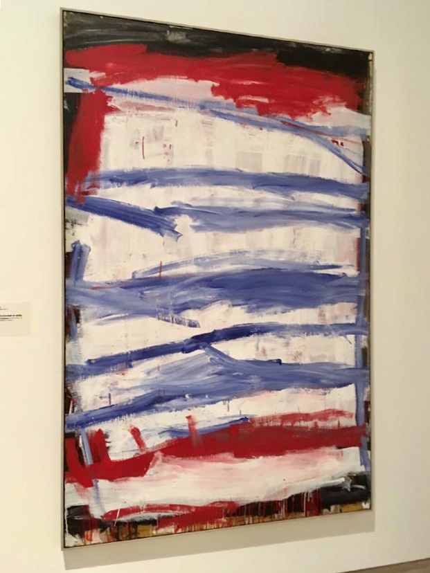
Tuckson’s lyrical works from 1970–73, the works that set him apart, are direct, hard hitting paintings imbued or bound by the artist’s sensibilities. They traverse neither decorative nor narrative territory, which allows the work to stay true to its emotional impetus. It is ‘one hit’ painting, ‘a home slog’, and as such it is hard to beat. The beauty of this type of painting is that it hits you again and again in the same fresh way every time you see it. Like Fairweather, Tuckson’s work is convincing. Makeshift values are apparent in the painterly decisions he made, his brush work and the materials he favoured. Builders or ‘bush’ handyman materials were used. Cheap masonite sheeting (left in its raw and flexible state) was preferred to canvas. House paints and house painter’s brush and charcoal were used in equal preference to fine artist’s materials. His loaded brush was delivered at full force in an open and direct way without cosmetic fuss about how the paint landed on the canvas. Technique was superfluous to ‘getting the job done’ as dribbles, drips and splashes were incorporated into the composition. This created patina of Tuckson’s surface is akin to the rough appearance of Lanceley’s Self Portrait, or Gasgoine’s weathered found materials. His last works capitalise the open field of the picture plain, at once recalling the wide open space of the Australian landscape without rendering it, for Tuckson ‘everything was space’[83]. Tuckson often described his brush work as up, down and across.[84] You could not get a more simple, ‘down to earth’, honest or unartful arm movement or interpretation of the rectangular painting surface. To emulate Tuckson is to take a journey into a visual toughness that allows no fuss. His paintings are as cultural Australian ‘makeshift’ as Pollock’s paintings are verisimilitudes of the American Wild West. Tuckson’s sophistication lies in his lack of contrived finesse. It was a choice to use hard-hitting non-decorative marks aimed at purely expressive spiritual outcomes. This is different to the Americans as it is more direct, open and economical, as if drawing at full speed or intensity—one line could express everything.'


Tony Tuckson at the AGNSW (photo Jan Courtin).


     77.  Tuckson’s sketchbooks were displayed in an exhibition at the Heide Museum of Modern Art.
     78.  Daniel Thomas et al., Tony Tuckson, 2nd ed. (Fishermans Bend, Vic.: Craftsman House, 2006), 19.
     79.  Ian Fairweather to T. Smith, (November 11, 1959) Bribie Island in Ian Fairweather, Bail, 160.
     80.  Daniel Thomas et al., Tony Tuckson, 9.
     81.  Ibor Holubizky, ‘Madonna Staunton: sorting through…organising things, in time…through time’, in Madonna Staunton, ed. Michael Snelling, 22, ‘the materials are very much related in the act of collage’.
    82.  Robert S. Nelson and Richard Shiff, Critical Terms, for Art History, 2nd ed. (Chicago: University of Chicago Press, 2003), 85. ‘French painter Georges Mathieu, following Harold Rosenberg’s interpretation of Jackson Pollock’s painting process, began to perform his action paintings before audiences in Europe, Japan, South America, and the United States’ in the 1950s. Author’s note: Kngwarray’s works have also been linked to a performance or the residue of.
     83.  Daniel Thomas et al., Tony Tuckson, 19.
     84.  Ibid.


Steve Riedell

Folded-Over Painting (white),2010,19 x 15 x 2.25”


‘Steve Riedell (American, b.1954) is a artist known for his three dimensional, mixed-media paintings. Born in Inglewood, CA, Riedell studied at Moorpark College and the Art Center College of Design in Pasadena. In his early works, he experimented with pale colors and gradually transitioned into stronger palettes, which included bottle greens, fire-engine reds, and neon oranges. In his well-known series of "folded-over" paintings, Riedell developed an oil and beeswax surface on a flat canvas, which was then cut and applied—or folded over—a geometric wooden armature, with traces of the process still visible in the final work.’ Artnet

Steve Riedell, from the Folded-Over Painting Series.

Steve Riedell, from the Folded-Over Painting Series.


Heidelberg School


Frederick McCubbin, Boy in the Bakery, oil on canvas, 48.9 x 59 cm. 


Frederick McCubbin, Boy in the Bakery, and part of a fence about 30 meters from the marker of the Heidelberg School house in Eaglemont. I feel the oven is so similar in both images that the building remnant in the fence may well have been standing when the impressionists painted there. It may even have been part of the original house as it was a tea room and a farm house before that. Not suburban as it is now.


Building remnant

Vermillion

Inroads to abstraction in vermillion by Walter Sickert, James McNeill Whistler and John Singer Sargent, 1880-90s.

Walter Sickert


James McNeill Whistler


James McNeill Whistler


John Singer Sargent


Camilla Tadich

Missing
Mars Gallery
1 – 20 December 2018
7 James Street, Windsor
Tuesday – Saturday, 10am – 5pm


Full Tilt, 2017, oil on linen 61 x 92 cm


Flightpath, 2018, oil on linen 55 x 40 cm.


'Camilla Tadich’s realist paintings of abandoned structures and detritus in the liminal zone where the forest meets the suburbs are a Baroque vision of the Australian bush.’ Tony Lloyd 2017

Of Colour and Light

Biennial of Victoria’s Women Abstract Artists
curated by Anna Prifti
5 – 27 October 2018
West End Art Space
185 Rosslyn Street, West Melbourne, Victoria, 3003, Australia

Hours: Wednesday - Friday: 11am - 4pm; Saturday: 10am - 3pm
Opening: 6 October 2-5pm
Opening Address: Kate Nodrum at 3 pm from Charles Nodrum Gallery

Artists: SAMARA ADAMSON-PINCZEWSKI, LOUISE BLYTON, ELIZABETH BODEY, TERRI BROOKS, ANNA CAIONE, MAGDA CEBOKLI, TRACEY COUTTS, ROZ ESPLIN, JENNIFER GOODMAN, FIONA HALSE, MELINDA HARPER, ELEANOR HART, SHELLEY JARDINE, WENDY KELLY, ROBIN KINGSTON, REBECCA MONAGHAN, SUZANNE MOSS, CATHY MUHLING, VANESSA OTER, FRAN O'NEILL, LINDY PATTERSON, LINDA PICKERING, WILMA TABACCO.


Installation view r-l: Fran O’Neill, Cath Muhling, Ros Esplin, Elisabeth Bodey, Vanessa Oter, Tracy Coutts

Installation view: Fiona Halse, Jennifer Goodman, Louise Blyton, Wendy Kelly

Installation view: Melinda Harper, Louise Blyton

Thinking of abstraction and the aspect of colour has led me to contemplate and reflect upon the many pathways that we might follow in doing so; the how, when, where, and why of making paintings. Seemingly a pathway without end. However, this path has often been at the expense of the contributions made by women artists who haven’t received the notice they deserve. It is the intention of this exhibition to enhance this conversation and to demonstrate again their contribution to the extraordinarily diverse nature of abstraction.

Colour and light draw us with considerable delight into an artist’s work, inviting us to explore their intentions and delve into the aesthetics of abstraction. The works in this exhibition exemplify a range of styles from the reductive and hard-edged to the more lyrical and intuitive; reductive, non- objective, concrete and neo-concrete, minimalist or the lyrical and expressive. There many tracks along that pathway. Artists have over time arrived at very much individual manifestations in their practice of abstraction.

In addition to the pursuit of formal or lyrical abstraction, artists also have drawn on other disciplines such as science or music, exploring these aspects in conjunction with their own practice to create new forms. Or their exploration may have led them to investigate different cultural forms. Whatever the artist’s position, the works in this exhibition demonstrate the capacity to combine materiality and conceptual thought to create diverse abstract responses. Their explorations demonstrate the questioning, the responding and ‘becoming’ in the process of making these works.

Colour is made up of wavelengths of light with each being a different colour. The colour of an object consists of the different wavelengths of light that it reflects. Its colour is also informed by the visual cortex of the observer’s brain and the colour she thinks it should be. It is interesting therefore to consider artists individual colour experiences and, in the making of a painting, how this personal experience of a colour is then mixed and transferred to a surface. The process is further enriched when considering specific colour or hues as there are many different versions of each. For example, red might be a pyrrole red dark or a light cadmium red. Looking at the colour wheel, there is both red- orange and red-violet but there are also numerous tints and shades of red.

When considering the effect of light on both the colour and its object for example as it changes through the course of a day and in different conditions, this requires in the rendering of subject matter the careful observation of the relatedness of shades and tones to light and the object. For the abstract artist the colour response might be a less literal, more perceptual one; the equivalent of received perceptions and sensations. She responds to formal colour relationships but also sees colour in action and acknowledges the interdependence of colour with its compositional placement and form.

As an attribute of appearance most things embody colour, its subtlety determined by the objects around it. For some colours, the material and tactile quality of the ‘being’ of a work comes from its capacity to communicate sensations, made by reflected light and creating a nuanced surface that is sublime or perhaps dynamic. In addition, these resonances received might originate in sound and noise, in light and the colours of weather or other aspects of landscape or place. Or it can be pre-determined by the artist’s specific ideas and completely unrelated to the physical world; colour as a supposition, so colour acting as an adjunct to the thought/form.

With monochrome abstract painting, colour stands alone and potent, as the ‘object’ and just ‘of itself’ though equally as complex as the careful consideration required in the placement of multiple colours in a deliberately patterned composition, or one that is arrived at by chance in a more immediate process of making. A focus on flat blacks or greys in painting might represent an attempt to rebut any sensation at all. Where colour dissolves, reduces, subverts the physical, the removal of what is inessential, it might be replaced by the geometric, by conceptual or intellectual processes or, on another level, the metaphysical ‘revealing’ of the essence of thought. The removal of ‘distracting’ sensations of colour, its beguiling nature, and an acceptance of simple form may open the way for a purity of conversation regarding this painted object. This leads me then into territory literally off the painted surface.

The relationship of colour to space is an interesting one. In addition to conventional and formal pictorial spatial relationships in determining its placement, we might consider extending the space of a painting to that beyond its surface area and how colour might engage with this notion. Within and outside the boundaries of the painted surface, the intention might be to subvert or reduce the conventional physical aspects of a work in favour of utilising the sensation or idea of space beyond or outside the object and so expand our experience of the idea of a painted work.

It is apparent that abstraction raises many questions and possibilities due to its capacity to communicate in multiple ways. How many readings of an artist’s work can there be? How many constructs and what might both the artist and the viewer bring to a work from their own experience? How can painting’s history contribute to this dialogue? For some, the experience of sheer pleasure might be enough. The ongoing interest in critiquing, re-viewing and expanding abstract practices, looking outward, bringing objects and digital forms into consideration and so encouraging new expressions, will continue to expand the abstract conversation in contemporary practice. Essay, Dr Elisabeth Bodey 2018

Peter Summers

‘Difficult Pleasure’
TACIT Galleries
Until October 21


Peter Summers


Peter Summers installation shot at TACIT Galleries

‘The landscape is a starting point, it underpins the initial preliminary stages of painting, but it is not about rendering a place. It is about capturing the essence of the connection with the landscape and how it reflects something of my temperament.’ Peter Summers

Fulham Grange

Eugene Von Guerard
‘The farm of Mr Perry on the Yarra’ 1855

Von Guerard’s painting of Fulham Grange, which was the original farm at Fairfield, Melbourne, and Coate Park today which was part of the farm. 


Eugene Von Guerard, The farm of Mr Perry on the Yarra 1855

Judging from the slope of the land the left boundary of the property adjoins Fairfield park boat sheds. Fulham Grange occupied Fairfield. 
Coate Park today which was part of the original farm


Fulham Grange farmhouse site


Fulham Grange occupied Fairfield. This house stands at the place of the farm house in the painting. It has very old timber features, a basement and a rotunda. The house faces the wrong direction to the street and the house number is incorrect making it likely that it stood prior to the first subdivision. Further the road behind the fence boundary in the painting follows the exact curve of Heidelberg road which is one of the oldest roads in Melbourne and developed as a track.

Heidelberg School Eaglemont

This is the spot where the Australian impressionists walked from their base house in Eaglemont towards Heidelberg to paint.

Mount Eagle subdivision open park

This is also an open communal park in the Walter Burley Griffin Mount Eagle subdivision.

  
Arthur Streeton painting


Above a painting by Arthur Streeton. Note the similarities in the light, the dirt road and the vegetation.


Old kitchen stove?

A part of a fence boundary that looks like an old kitchen and the other side of the fence. Could this be the remnants of the cottage in the painting? This building structure is 50 metres from where the Impressionist's camp house stood. It, in theory, could be an out building.


Stone Wall

There is nothing left of the original farmhouse they painted in. However this section of this house was quite likely was standing and it’s the only structure from that time in the area. Interesting that Griffin kept this area open only 30 years later. Maybe he knew?


John Nixon

Faktura (Experimental Painting Workshop)
To August 18
Anna Schwartz Gallery
Melbourne


Silver Konstruction 1, 2017, enamel on canvas with paint roller, 51 x 40 x 5 cm.


Gold Konstruction 1, enamel on canvas with broken wood 60 x 45 cm.


Installation photo


Installation photo